Event Navigation
The Event Navigation contains a list of all event components which can be accessed by the participants or visitors through the navigation bar on the event website.

It allows you to customize your event You can find it in Configuration > Event Navigation.
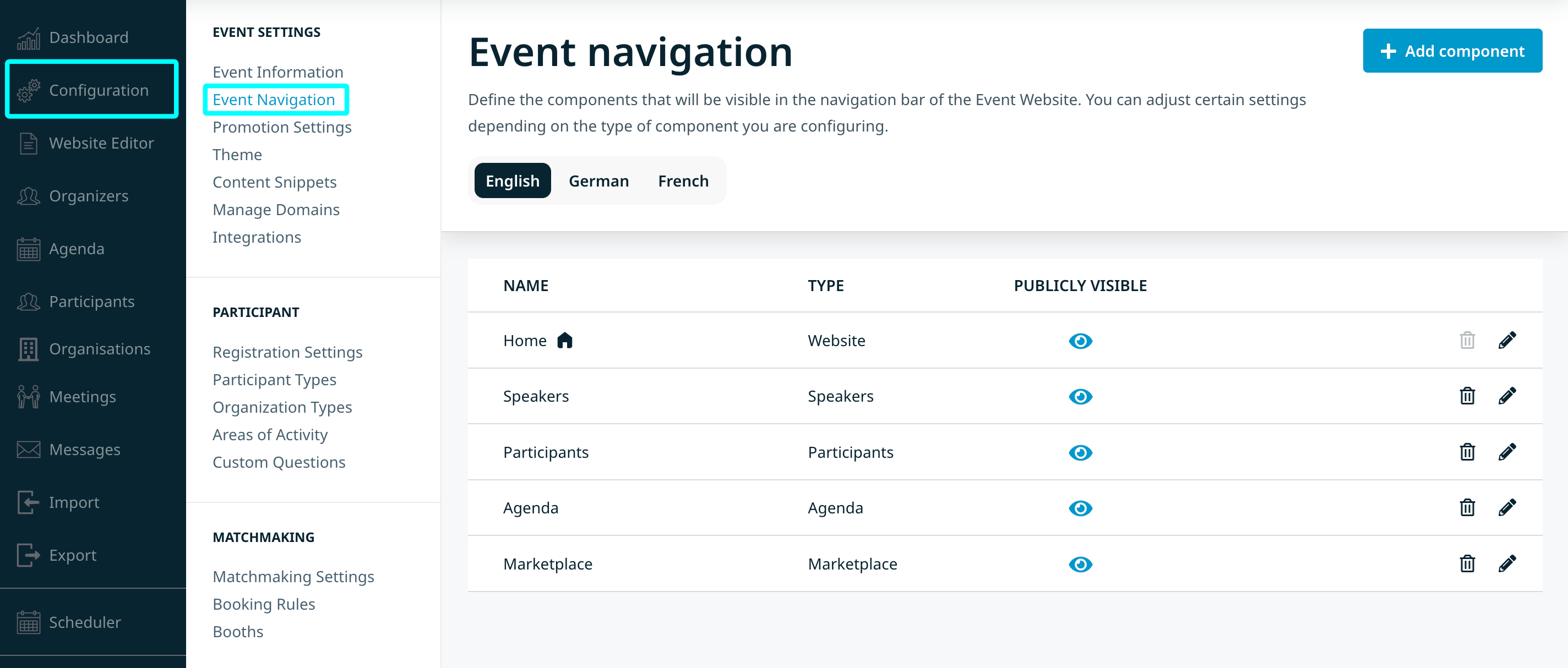
The main page shows a table of the components currently accessible to the participants. Each row represents one component, while the columns provide additional information:
- Name: displays the component title, how users see this component in the navigation bar on the Event Website.
- Type: displays what kind of component this is (agenda, participant list, etc.)
- Publicly Visible: this symbol indicates whether unregistered users see this component in the navigation bar or not.
- Delete icon: removes the component from the navigation bar.*
- Edit icon: allows you to change certain settings depending on the component type, as well as to rename the component and provide translations if your event is multilingual.
* Please note that removing a component from the navigation does not necessarily disable the actual functionality on the event. For example, removing the participant list does not mean deleting the actual participant profiles; it just means that participants will not be able to access each other’s profiles through this page.
The house symbol indicates which component is defined as the landing page (a page that users see first when they come to your event website). Our internal Home page is marked as the landing page by default.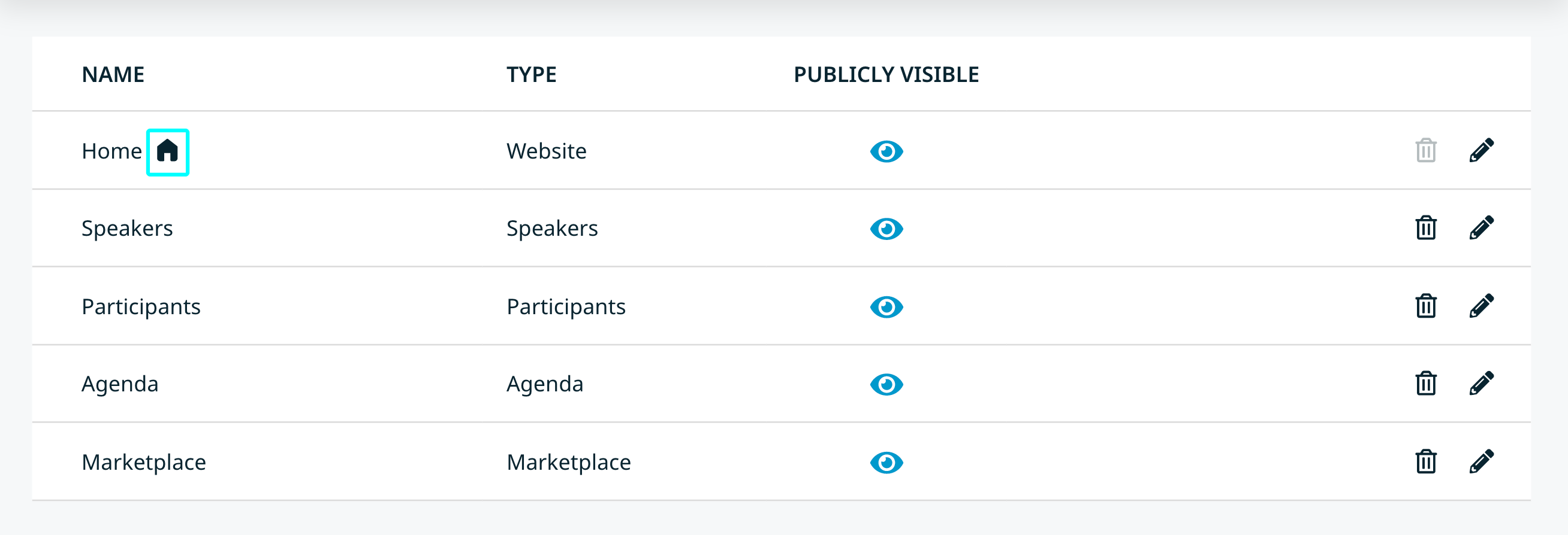
Please note that you cannot delete a landing page. You have to define another component as the landing page before you are able to delete that component. To do so, place another component at the top of the list which will mark that component as the landing page.
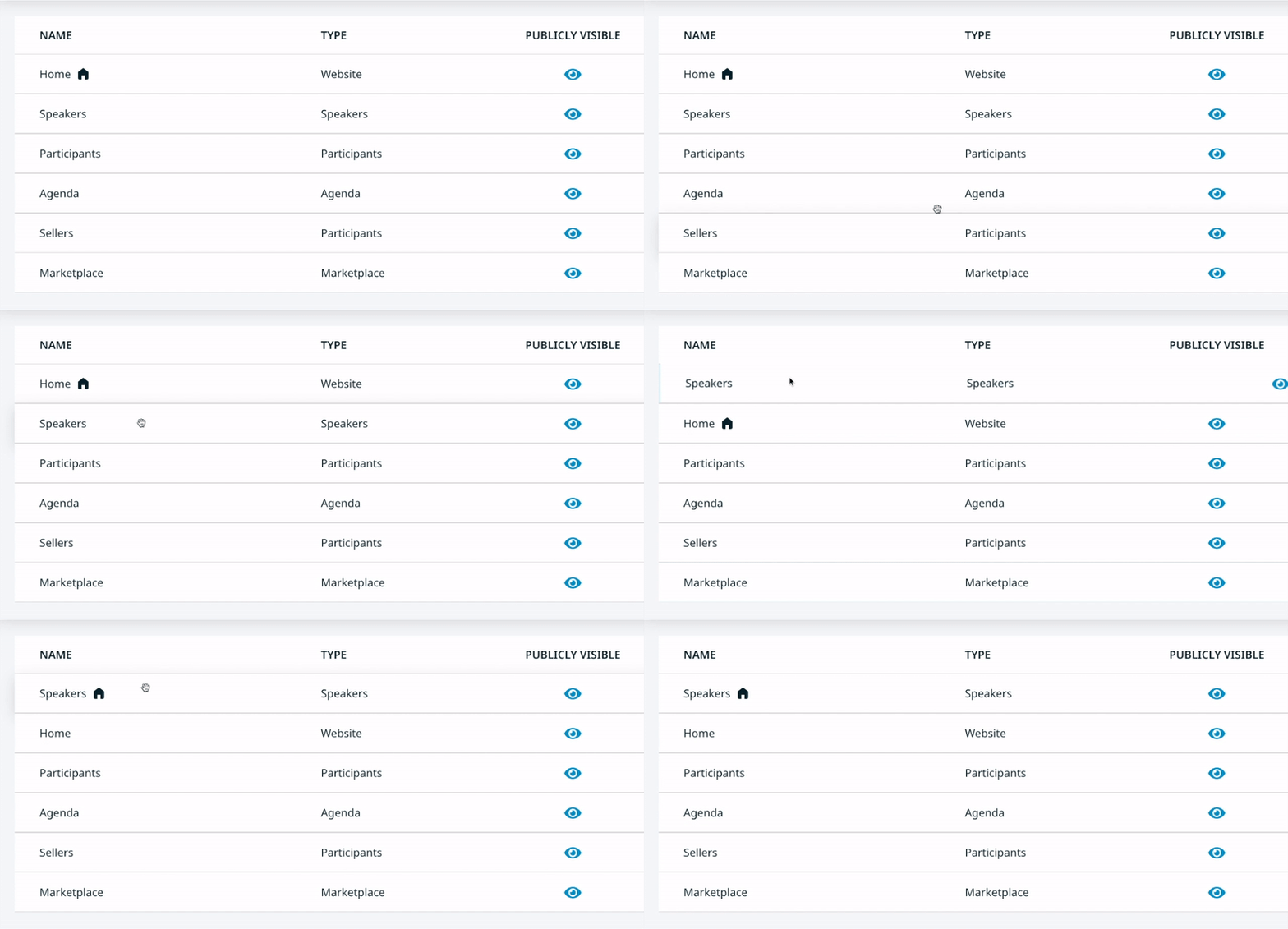
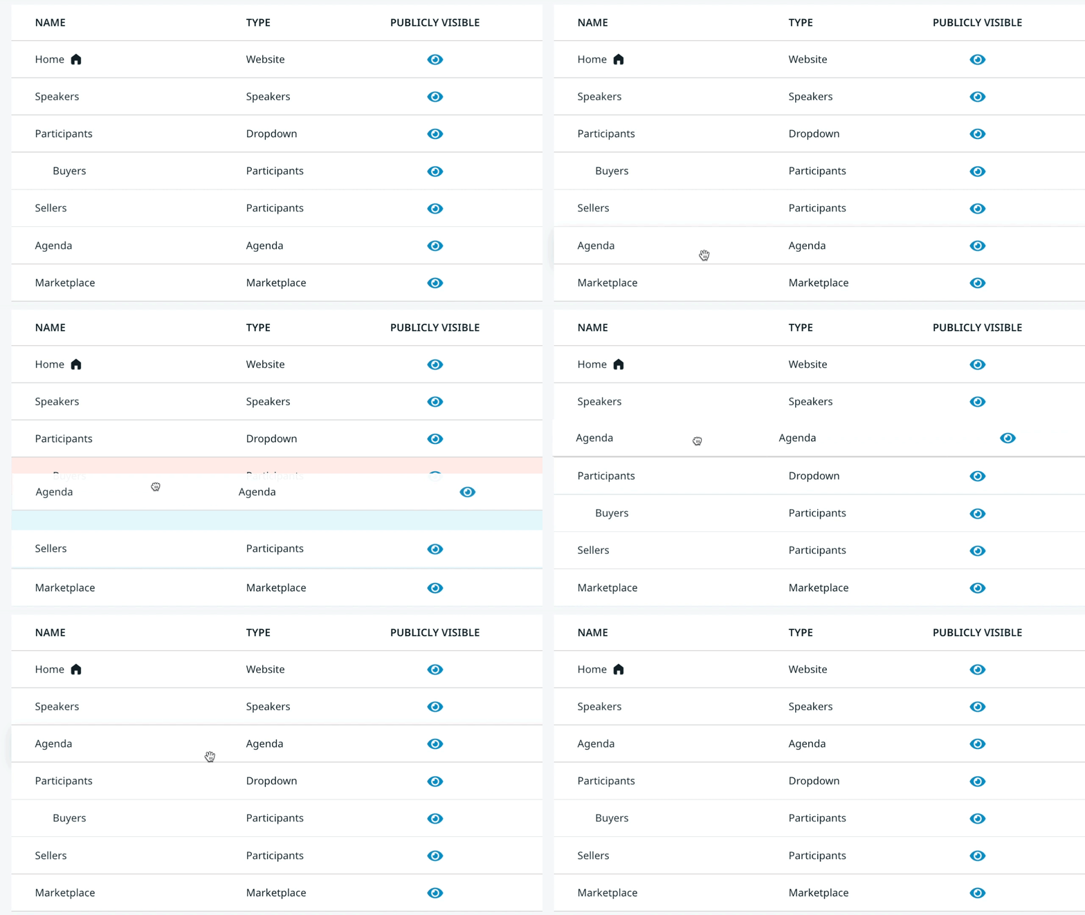
You can rearrange the components however you like, simply click and hold a component, drag it to the position you want, and then release.
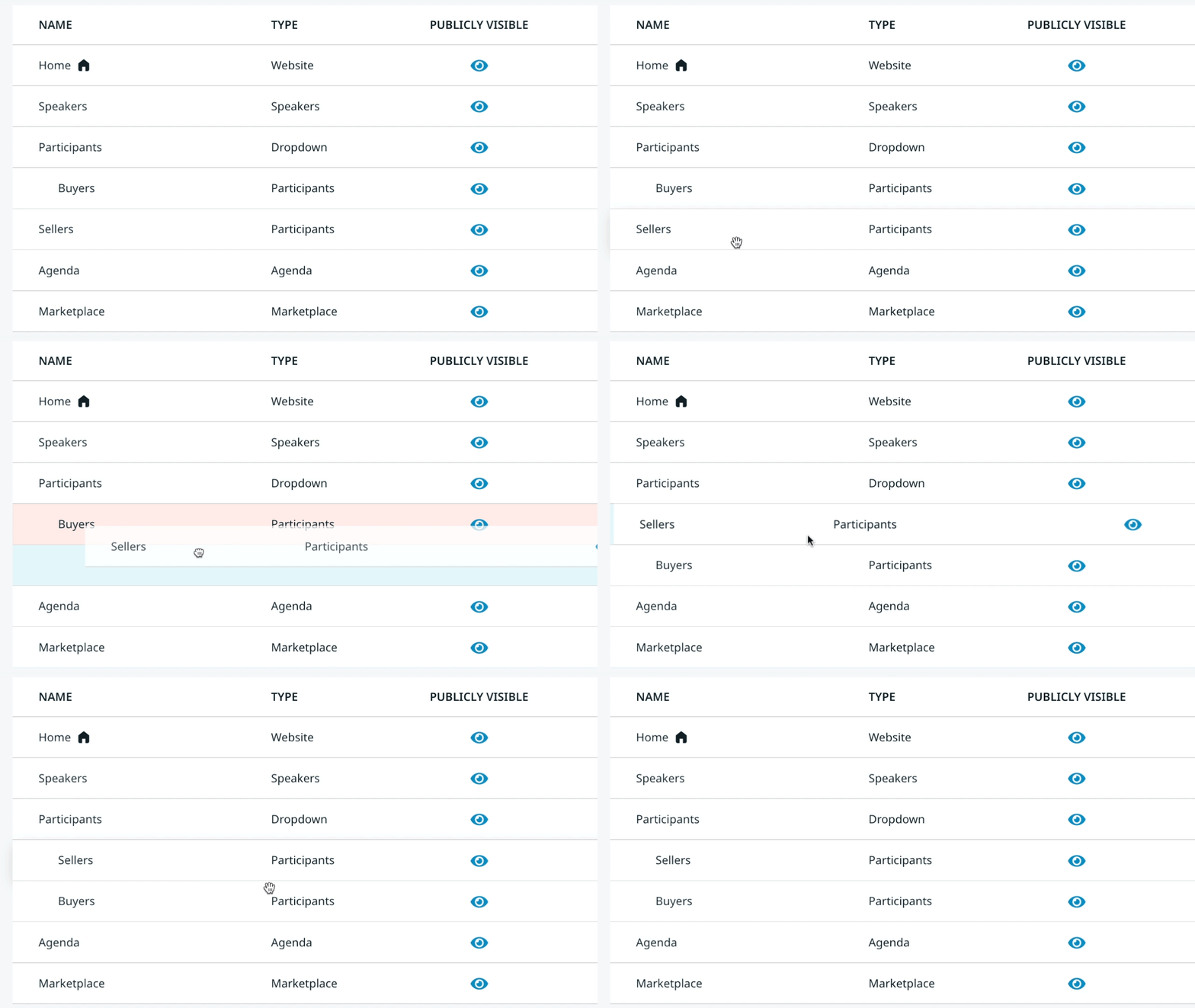
If you have a Dropdown menu, you can add new components into it by clicking the “+” sign. To add an existing component, drag and drop it into the Dropdown.
This is what a dropdown menu looks like for the participants on the event website: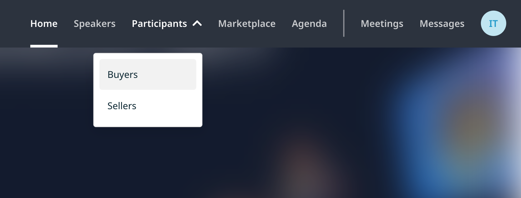
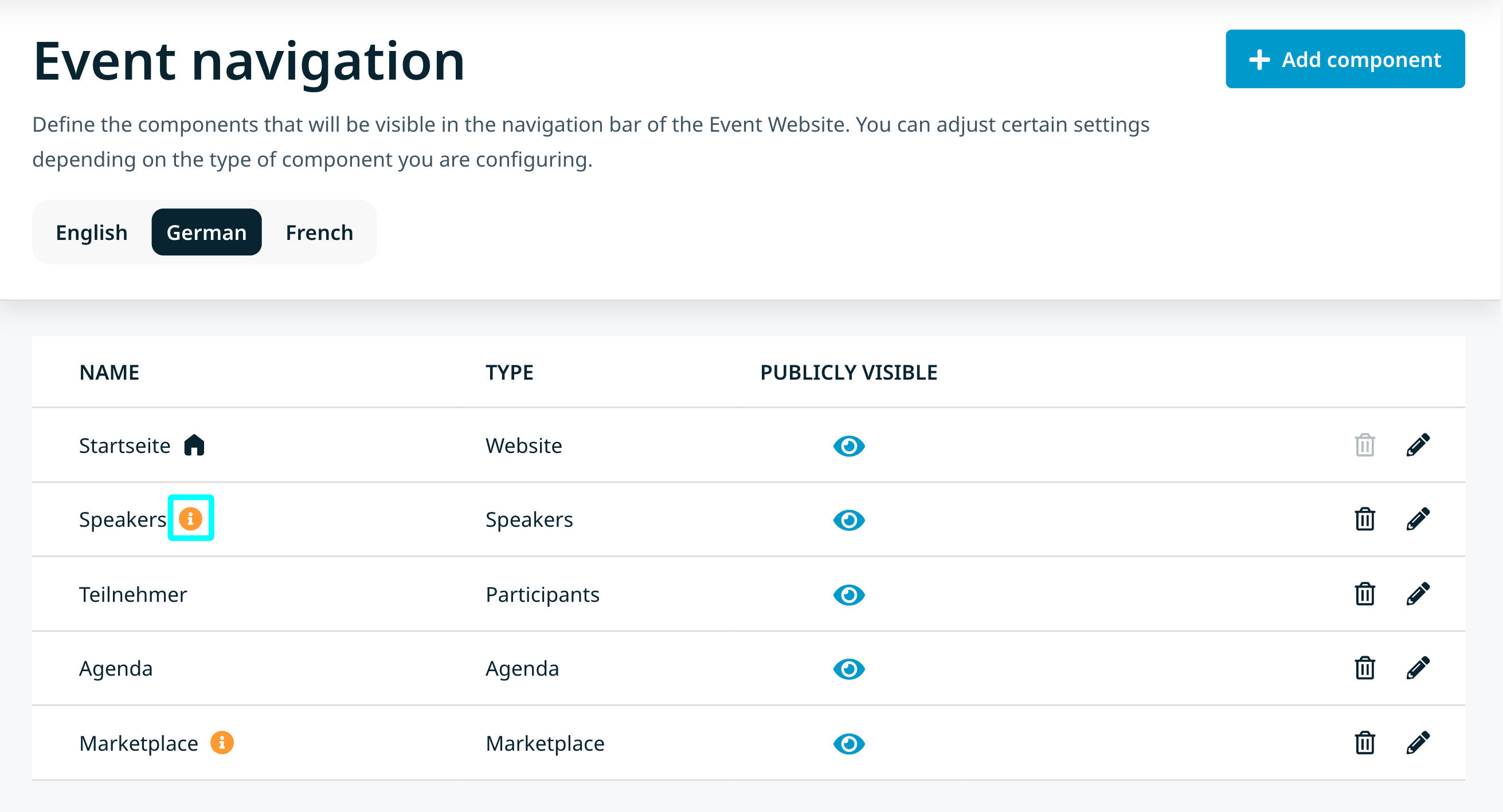
For multilingual events, you can easily switch between the languages to see what the navigation looks like in each language. If a component has not been translated, it will be indicated by the orange info icon next to the title of the component.
